Club

How many jewellery houses can you recognise by colour alone? Some fine jewellery maisons and high jewellers have become synonymous with very nuanced shades of blue, purple, pink or red that encapsulates not only their history but their ethos, ideas and output. Here, we share the ‘signature colour’ stories of some of the world’s most recognisable brands, including Tiffany & Co., Boodles and Chaumet…
Imagine you are invited into a room with five boxes laid out on a table. Each box is plain and identical in shape and size, the only difference is the colour. The colour represents the brand of the item inside. Would you know instinctively which brand is which? This is the power of a signature colour that, when used consistently over decades, can become completely inseparable from a household name.
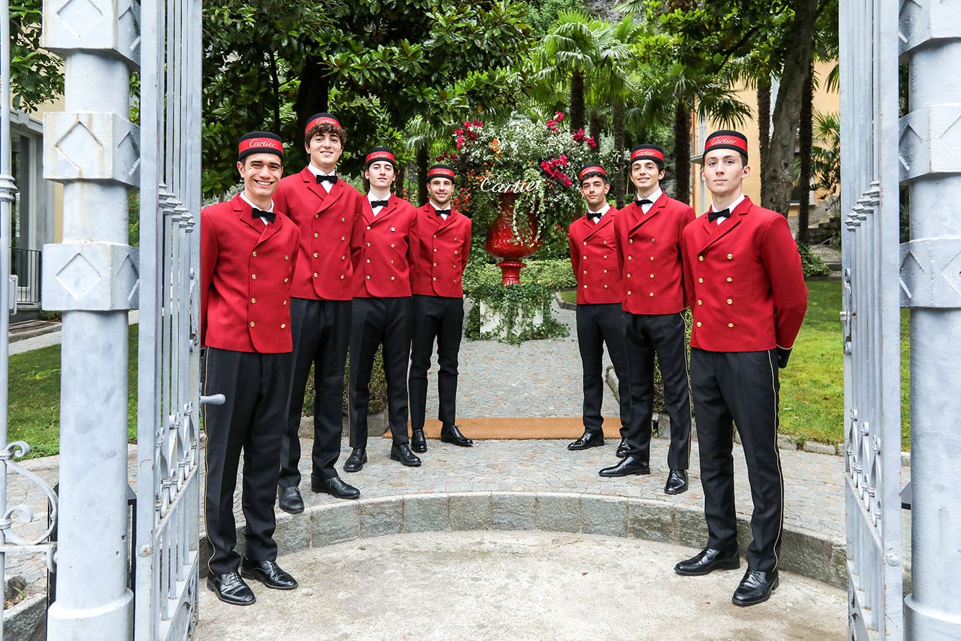
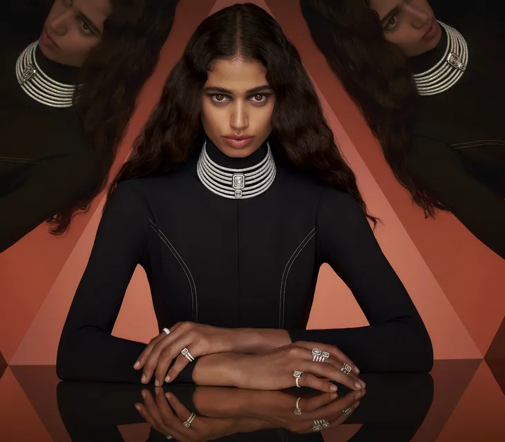
Guests arriving at the Sixième Sens par Cartier High Jewellery Collection launch in Lake Como, Italy, were welcomed by waiters in the maison's recognisable red hue
Laurie Pressman, Vice President of the Pantone Color Institute, says: With 80% of our human experience filtered through our eyes, visual cues are vital to successfully getting a message across. More than text or shape, the colour a brand chooses is its calling card. As each colour has its own message and meaning, the more you learn about this critical design element, the more you will be able to leverage its powerful effects.
As I mentioned in a recent article about the pricing of jewellery, an important aspect when determining the value of jewellery is the desirability of its branded origins. That’s why signed pieces often outperform their unsigned peers at auction. One small part of this brand signature is colour, and it can be surprisingly easy to identify jewellers by colour alone, especially in packaging, imagery and boutique décor. Here are some of my favourite examples…
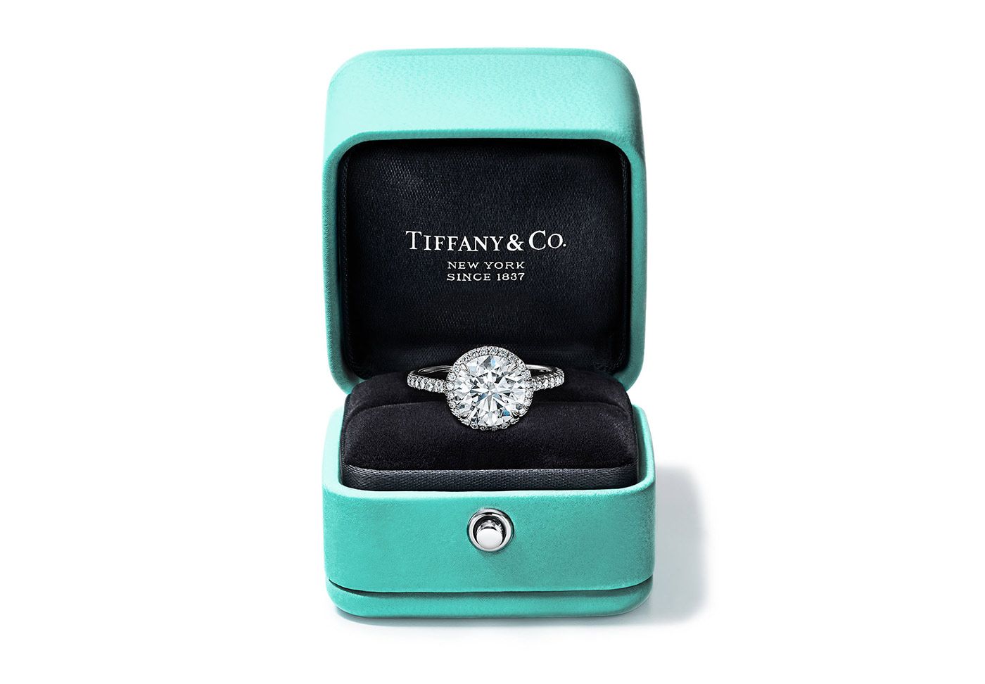
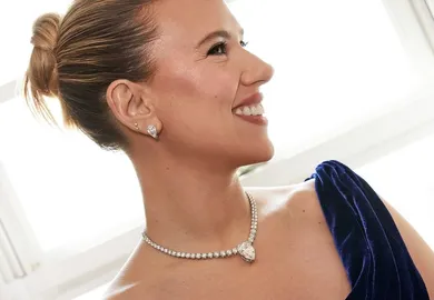
A Tiffany & Co. engagement ring inside a Tiffany Blue box
The iconic Tiffany & Co. robin’s egg blue (sometimes described as ‘forget-me-not’ blue) is perhaps one of the most famous brand colours in the world, not just in the realm of jewellery. According to the brand, there is no definitive answer as to why Charles Lewis Tiffany chose the distinctive hue to represent his brand, but “some theorize that it was because of the popularity of turquoise in 19th-century jewellery”. It’s true that turquoise was a favourite of Victorian brides who gave their attendants a dove-shaped brooch of turquoise as a wedding day memento. Since 1998, Tiffany Blue has been registered as a colour trademark and, in 2001, it was standardised as a custom colour by Pantone under the name “1837 Blue,” in honour of Tiffany’s founding year.
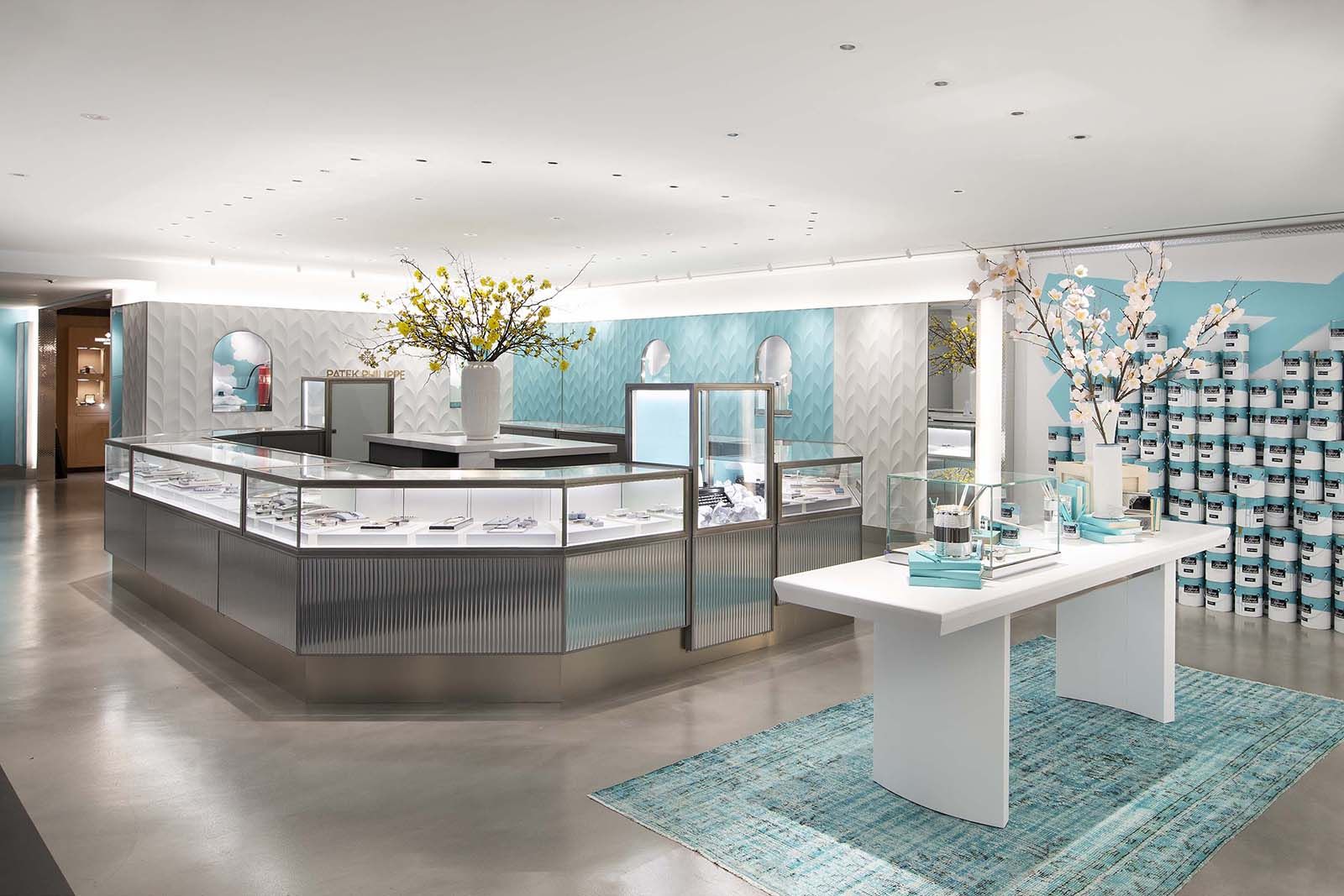
An example of how Tiffany & Co.'s robin's egg blue colour is used in store
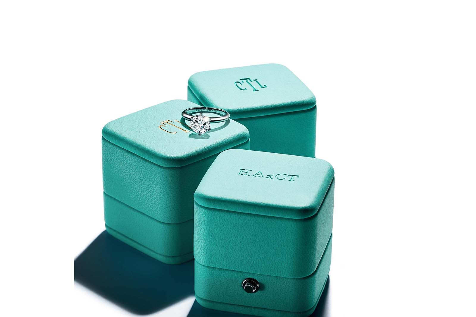
Tiffany Blue ring boxes have become a symbol of jewellery luxury
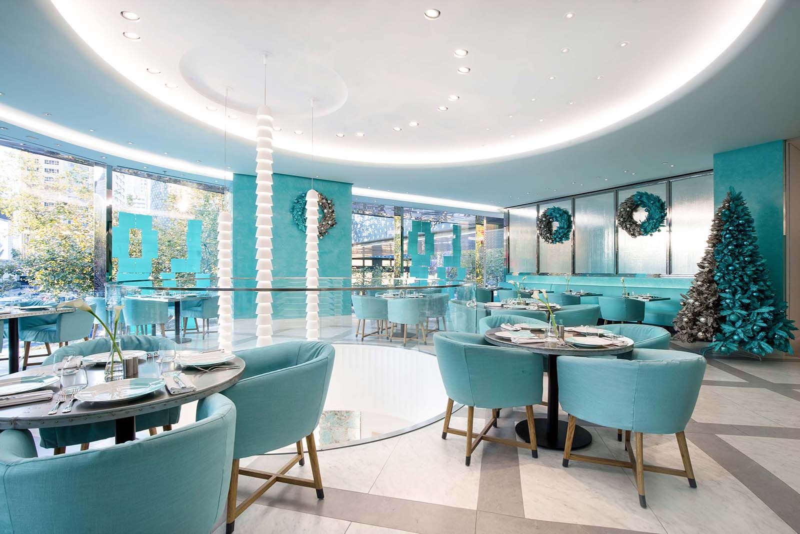
Tiffany & Co. café decorated with the brand's signature blue colour
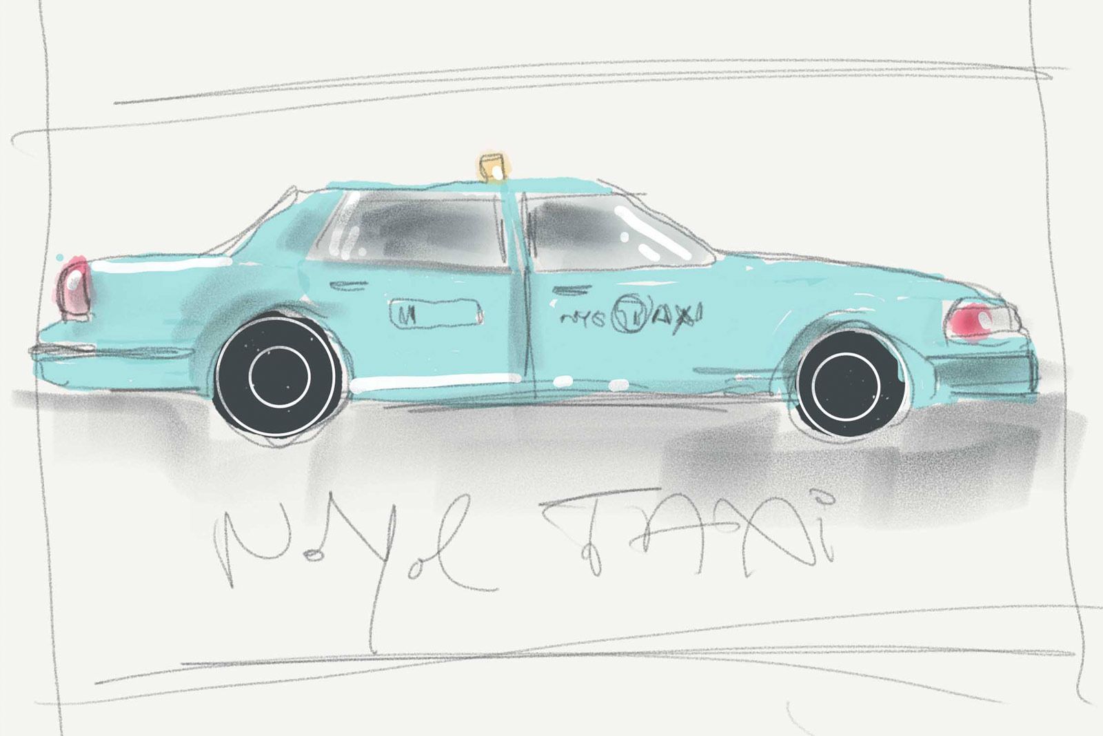
A sketch of an iconic New York Taxi cab reimagined in Tiffany & Co. blue
This British high jeweller has managed to claim a distinctive shade of pink as its signature colour, which is the perfect balance of pastel, punchy, feminine and luxurious. “The story behind Boodles iconic shade of pink demonstrates just how storytelling can add meaning,” the team explains. “The colour was inspired by the candy shade of an incredibly rare diamond sourced by Nicholas Wainwright, Boodles current Chairman, during one of his first trips to source stones.” From this moment on, Boodles has found inspiration in the hue and, according to Nicholas himself, it is a constant reminder to “aspire to the exceptional”.
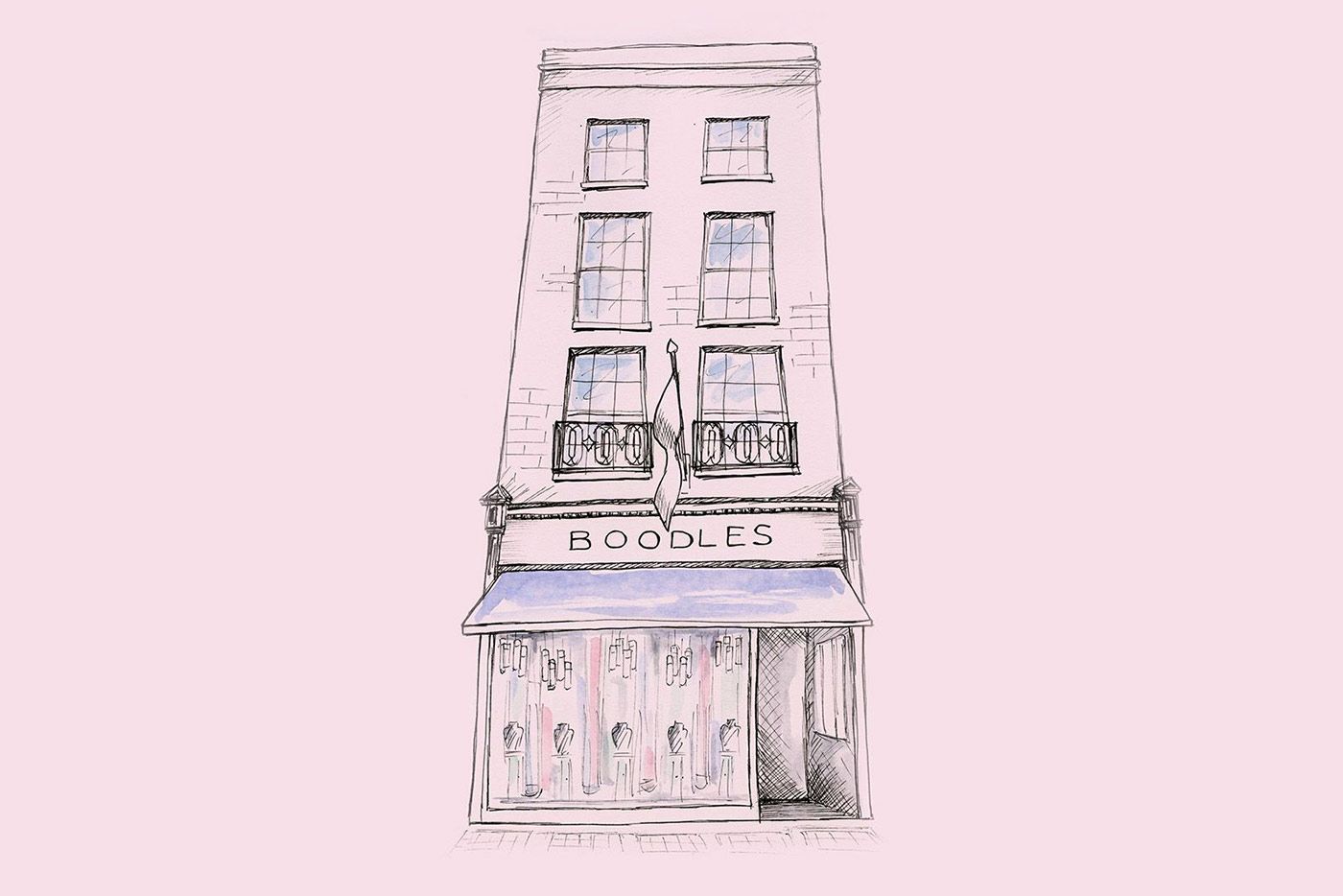
A sketch of Boodles' Bond Street store in its signature pink colour
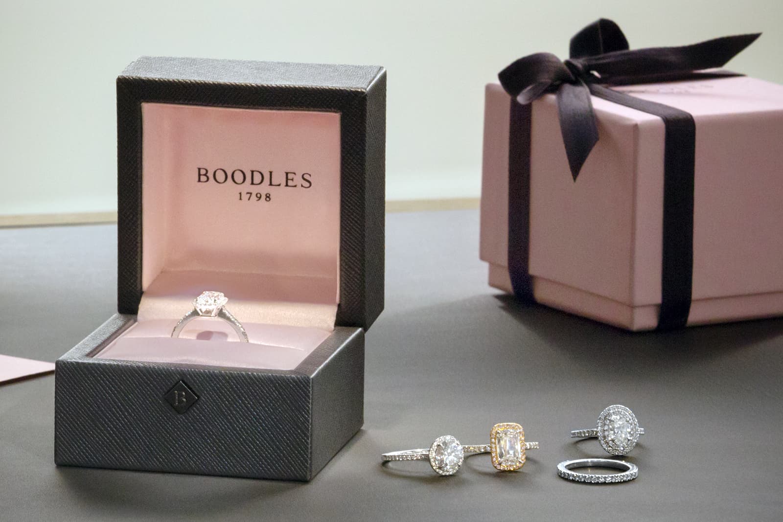
Boodles ring boxes with its pink brand hue lining the inside
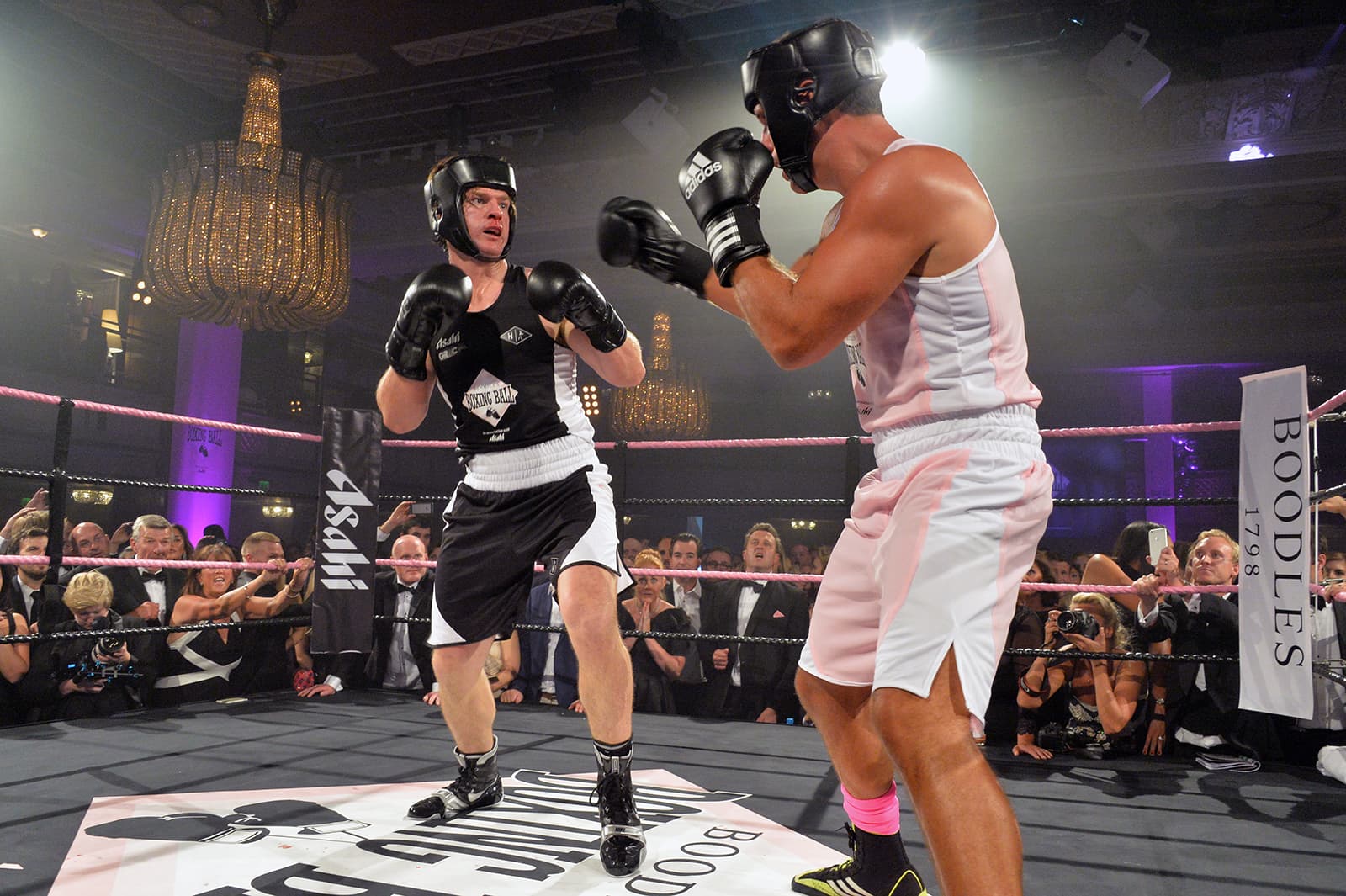
A brand's signature colour can be used at various events, just like this Boodles pink themed boxing match
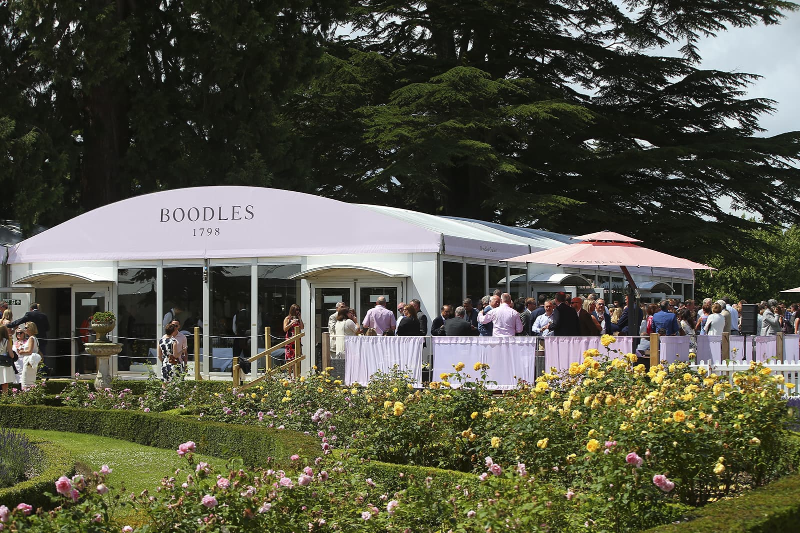
Another example of Boodles' pink signature colour at a garden party event
The heritage French maison has always had an affinity with blue, but it wasn’t until the year 2016 that Chaumet mastered its own specific shade that’s become synonymous with the brand. According to CEO Jean-Marc Mansvelt, the colour that previously existed was “superficial, 2D and cold”. He continues: “When I decided to change it in 2015/2016, I wanted to have a more warm, consistent, intense blue. I also wanted a more inspired blue that reminded us of the Kings of France, or the blue of Sevres. My idea was to search for and to find a more referenced and narrative blue.
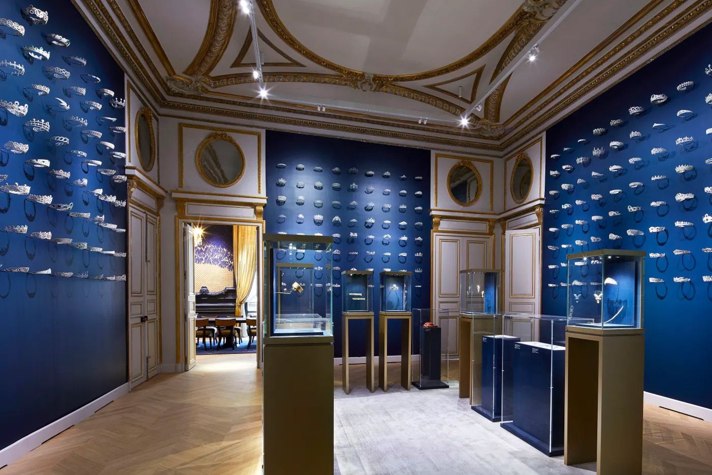
The interior of a Chaumet boutique with its signature blue shade lining the walls
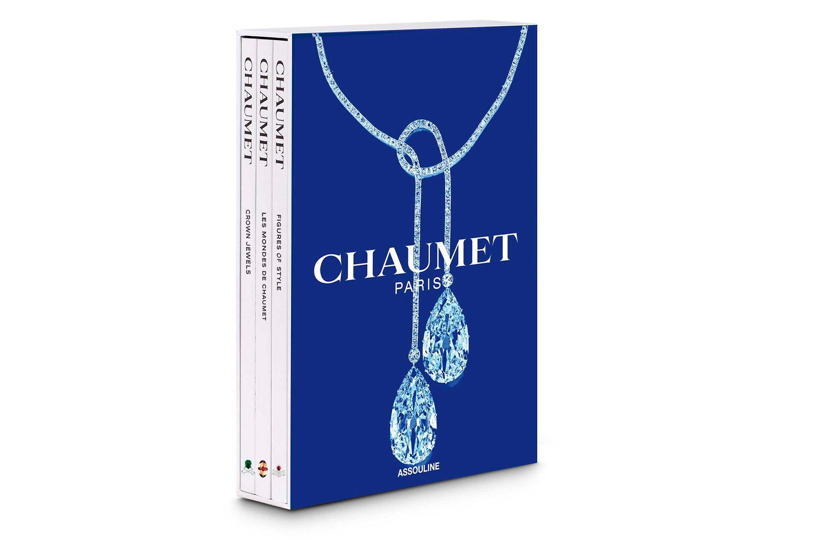
Chaumet coffee table books decorated with its recognisable blue hue
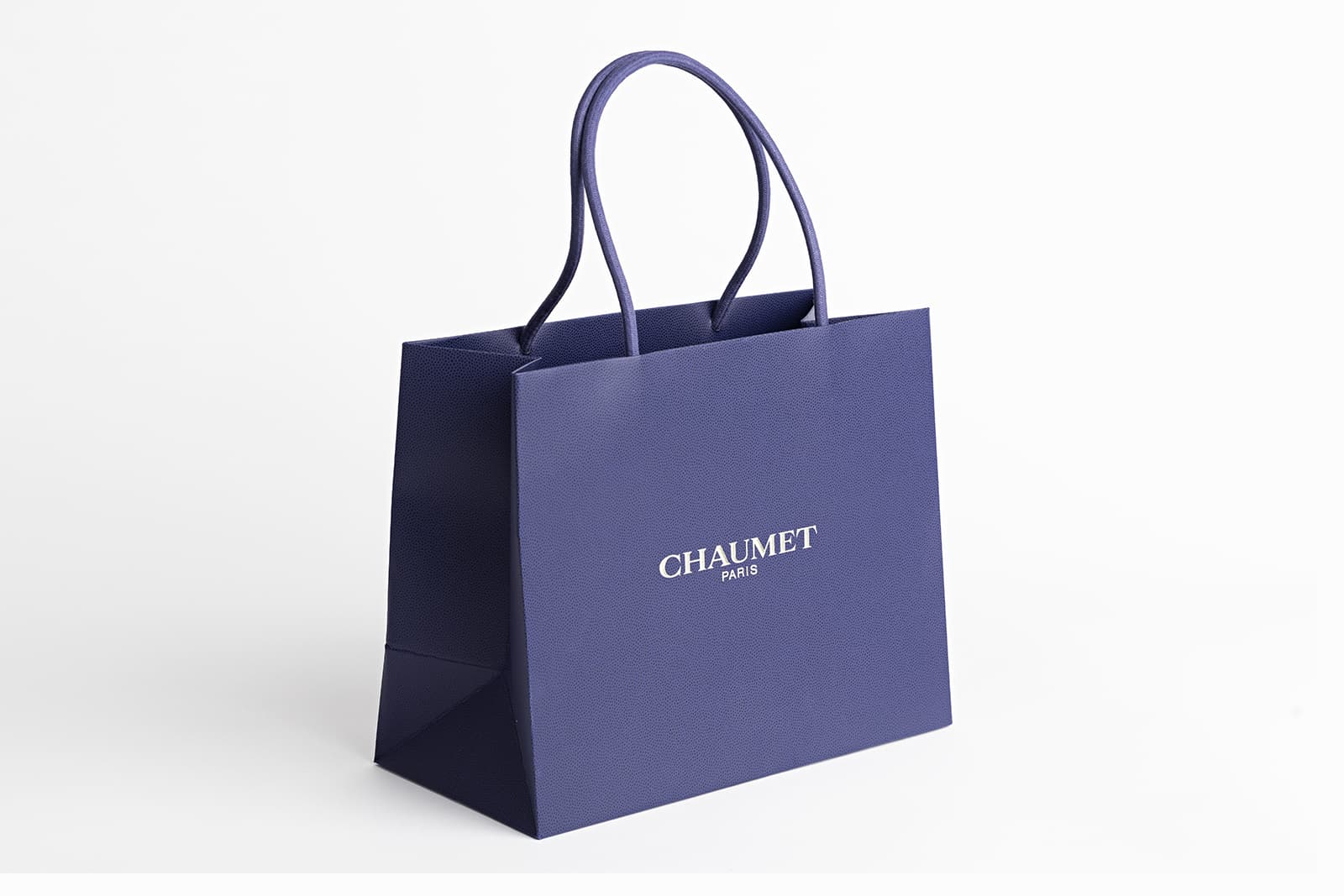
Chaumet uses its signature colour on packaging and bags that its clients take home
Blue is an extremely interesting and kind of alive colour. It’s important to underline that this colour is extremely complex to work with since it has a multitude of nuances and effects that can rapidly change depending on the base you’re working on. If we go back in history, this was one of the reasons why blue arrived quite late in comparison with others like red, for example, which was already used by the Roman Emperors.
The signature colour of French jewellery maison, Chaumet
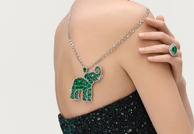
The colour red is all about passion and desire, which would make it a bold choice for luxury jewellery brands if it wasn’t for one small detail… Cartier. Since the 1840s, Cartier has managed to corner the market for a bright red shade. In fact, its red boxes are famous and collectable, even without jewellery inside! Francesca Cartier Brickell, best-selling author of The Cartiers, says: “Cartier has become synonymous with the red box, but, looking back, the Cartiers were not averse to using different colours when the occasion, or the client, or indeed the jewellery, called for it. I’ve seen beautiful vintage Cartier boxes in a variety of colours: many shades of red and green but also elegant black or cream. As an example, my grandfather explained to me that he wouldn’t typically put rubies in a red box: he often chose green leather for ruby jewellery instead as he felt it showed off the gems to their best advantage.”
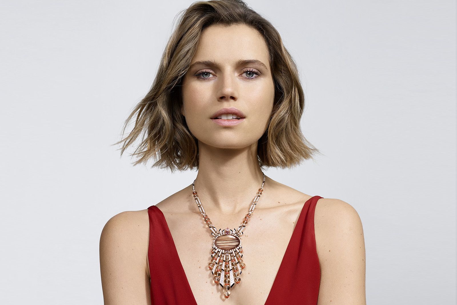
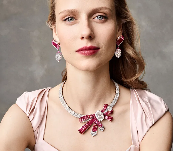
A model wears the Cartier Magnitude Aphélie necklace in a red dress that's iconic of the maison
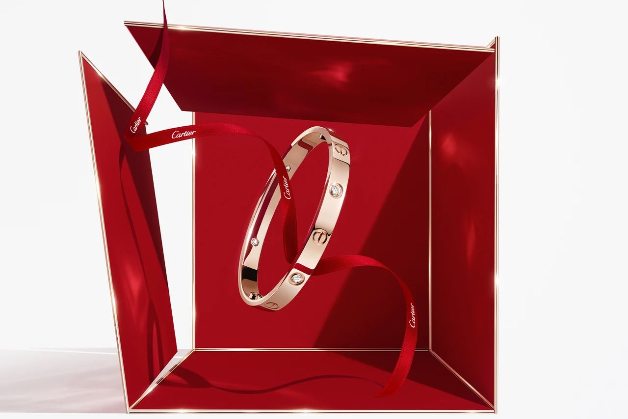
An example of Cartier branding with the brand's signature red colour
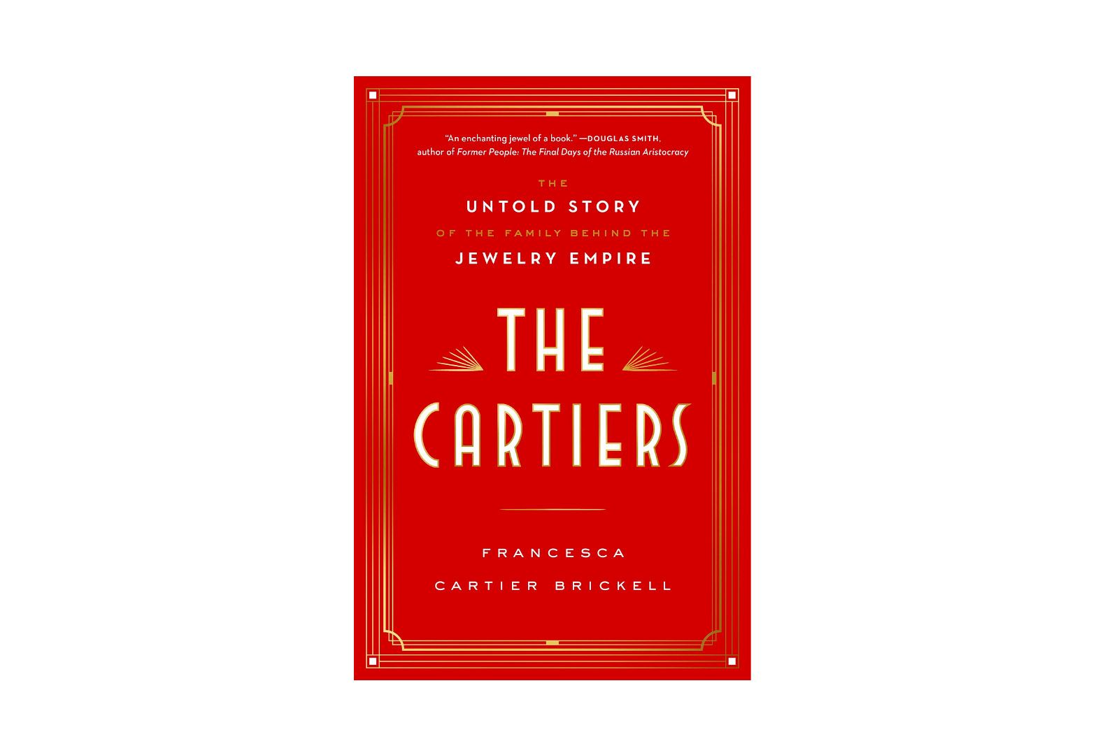
The front cover of The Cartiers by Francesca Cartier Brickell
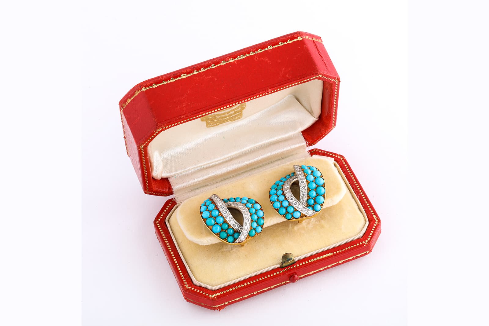
Cartier turquoise and diamond clip earrings set in platinum and gold, sold by A La Vieille Russie
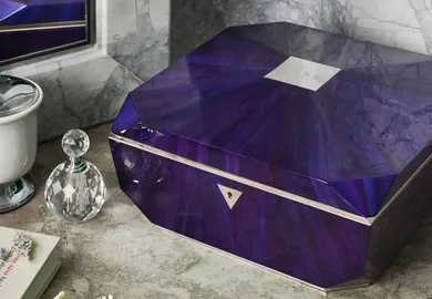
Finally, we can’t forget Boghossian and its gorgeously sumptuous shade of purple. Managing Director, Roberto Boghossian, explains: “Purple is a bold and compelling colour often perceived as a symbol of creativity and innovation – inherently linked to our key pillars as we have built a reputation for our cutting-edge techniques and audacious designs, by constantly pushing further the boundaries of jewellery craftsmanship.” This reiterates the power of colour to communicate core brand values, whether that’s innovation like Boghossian or drama, history, heritage, passion or rule-breaking rebellion.
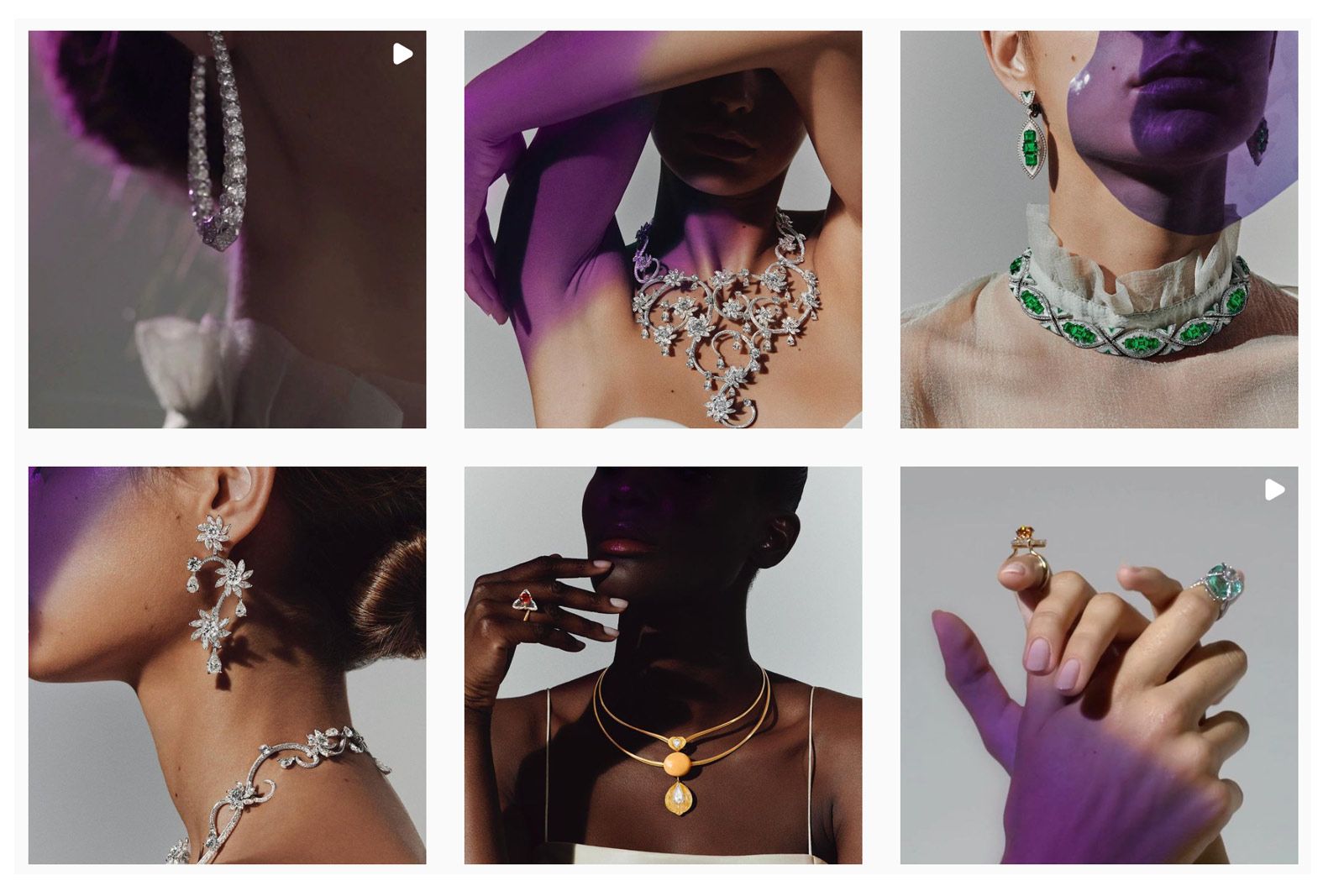
Boghossian's signature purple colour on the brand's Instagram
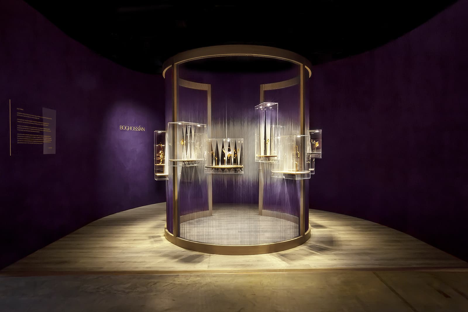
Ac Boghossian installation in its signature purple shade
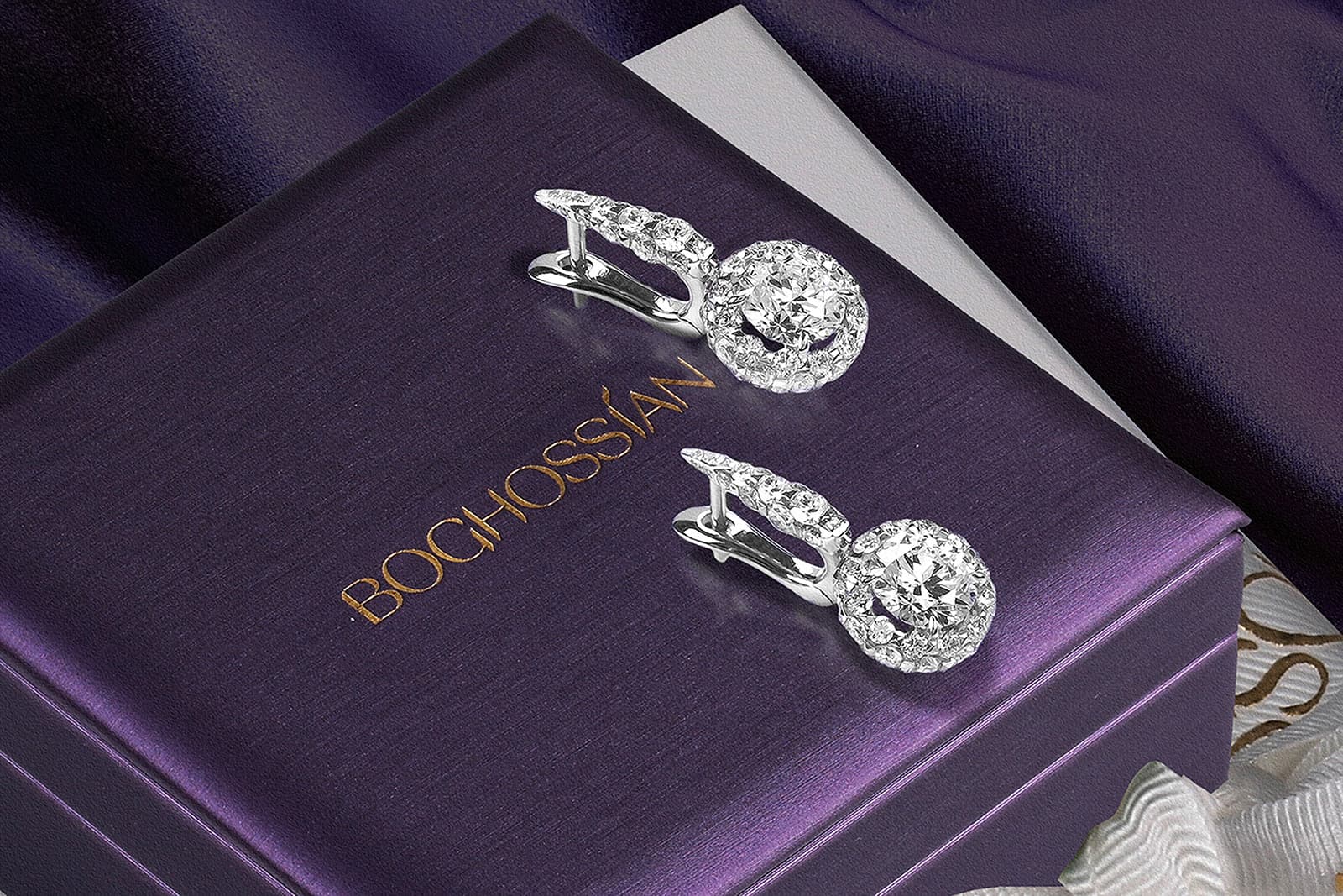
Diamond earrings on top of a purple Boghossian box
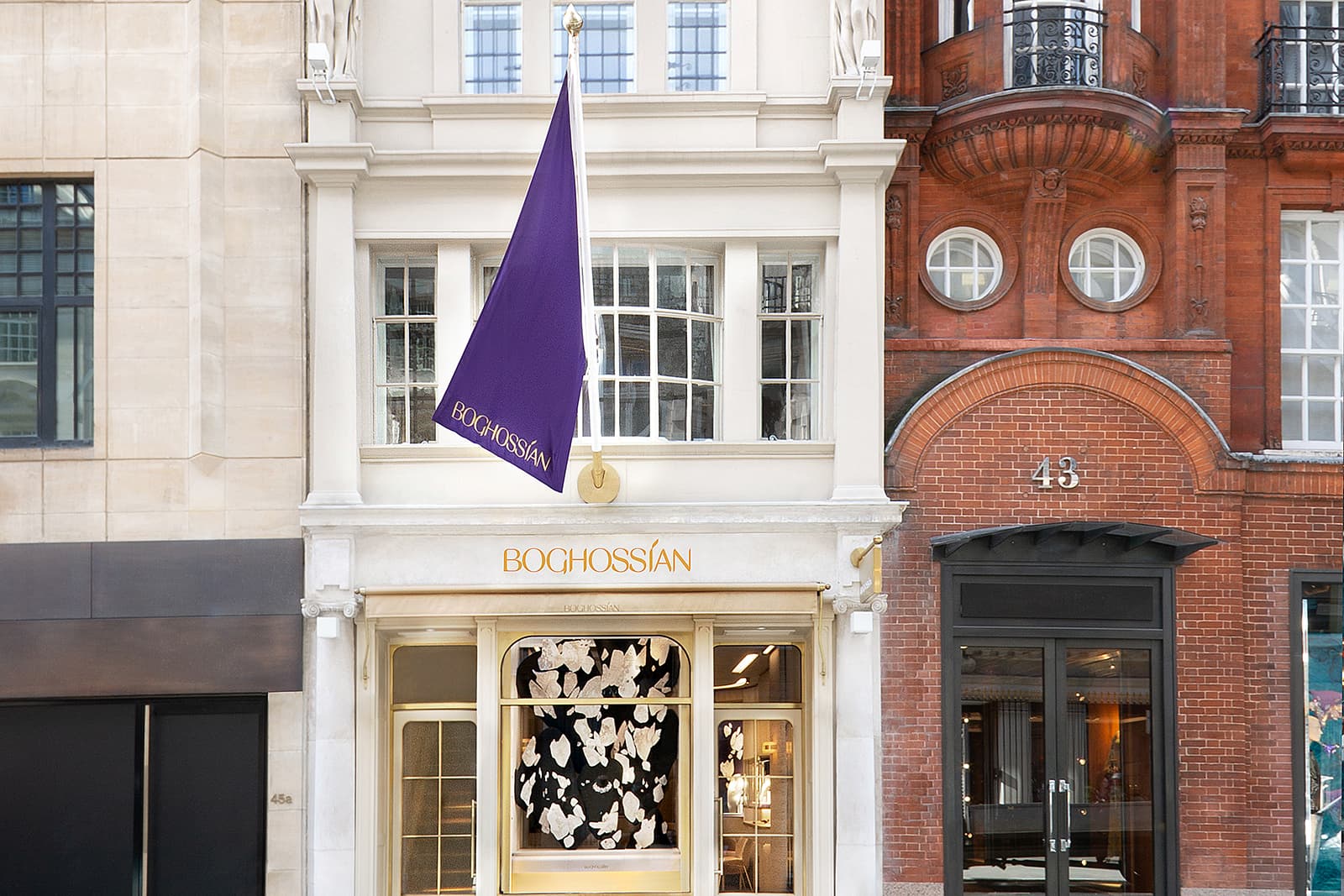
The exterior of Boghossian's London boutique with a purple flag flying
Colour isn’t a quick or easy decision, it’s a fundamental part of the story. Just as human body language communicates on our behalf, so too does the shade a business chooses to represent its ethos and intentions. I am sure you will agree that the brands mentioned above all chose very wisely indeed.

WORDS
Sarah Jordan has specialised in content writing, editing and branded storytelling for a range of businesses, including De Beers Jewellery, Sotheby’s, the Natural Diamond Council and Gem-A. She is also the founder of her own specialist copywriting business, The William Agency.
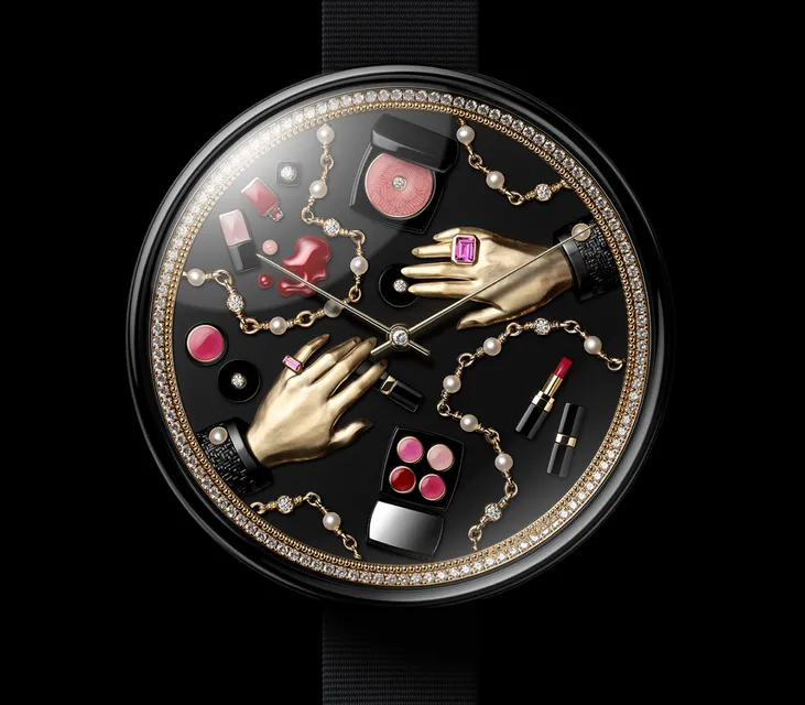
From lovers kissing on a bridge to precious animals painted in enamel or gems, this year’s watch launches included timepieces with extraordinary dials that blur the line between watchmaking and wearable art.
Today, I want to share my thoughts on embracing your inner self and channelling all that power into your biggest passions…

Jewellery designers are increasingly turning their artistic talents to the world of horology, customising luxury watches with unique embellishments that carry their personal style signatures. From reimagined Rolexes to gemstone-studded bezels, discover how jewellers are making their mark on the world of timepieces

That nostalgic feeling of seeing past creations—sometimes forgotten, sometimes iconic—sparking a rush of inspiration to reimagine and breathe new life into what once was. That's exactly what Boucheron has achieved with its latest revival: the Serpent Bohème Vintage collection

The Mystery Setting by Van Cleef & Arpels stands out as a masterpiece of Art Deco ingenuity. As the world celebrates the centenary of Art Deco in 2025, we are taking the opportunity to spotlight one of the most technically ambitious innovations to emerge from this golden era of jewellery design
There's nothing quite like the thrill of a new collection unveiling. But what truly excites me isn't just the sparkle and glamour – it's when a brand takes a bold and unexpected approach. This is exactly what Chopard has done with its latest Insofu High Jewellery collection, which all started with the extraordinary 6,225-carat 'Insofu' rough emerald. Let's take a closer look at the creations that have emerged from this incredible mineral specimen

From diamond-drenched serpents to enamelled blooms and secret talismans, these new jewellery watches unveiled in Geneva embody the artistry, emotion and extravagance of high jewellery watchmaking for women

The Dionysios signature is all about warm, soulful jewellery that’s characterful without being overtly historical or too starkly modern. Let’s take a closer look at some of the brand’s highlights…
Let's consider pieces that showcase this method of craftsmanship in all its sparkling glory…
For designers like Meghna Biswas, the woman behind Zome Jewellery in the United Arab Emirates, the process of transforming coloured gemstones and precious metals into beautiful creations is an ever-evolving love language
Take a look and consider the incredible feats that artificial intelligence can achieve in empowering creativity and broadening our minds

From the legendary Van Cleef & Arpels Jarretière bracelet worn by Marlene Dietrich to a striking aigrette that was once part of the Al Thani collection, all the pieces below are infused with the fearless originality of the Jazz Age


Add articles and images to your favourites. Just

Creative Director Francesca Amfitheatrof offers her unique interpretation of a pivotal period in France’s history, marked by the French Revolution, the Napoleonic era, and the rise of industrialism


Paraiba: The Legacy of a Color
Jewellery Insights straight to your inbox